How to Make Your Website More Mobile-Friendly?
Industry leaders have been talking about the importance of mobile-friendly websites for a very long time. Seriously, I remember back in 2019 when I’d just landed my first real job, the SEO manager at the startup I was working at quit over it. Yeah, he was adamant on making everything on our service’s website more mobile-friendly; wanted developers to maybe think of an app? The man was really good at what he did, by the way. He actually helped me understand a lot of the fundamentals with SEO.
I won’t lie; before that, while freelancing, I’d get keywords from people, and I’d just add them as naturally as possible, about eightish times in a 1,000 word blog. Oh, and once on the meta title and meta description. I’ve also lost clients over the fact that I would add a preposition or something to make the awkward keywords more sensible.
People just don’t know much. But we’re going off on a tangent here. Point is, people have been talking about mobile-friendly websites for at least a decade; maybe since even Facebook came out.
But as a new blogger, who doesn’t know much about SEO and the crazy Google land we all live in, you wouldn’t know that. And it’s fine because that’s why you’re here:D
This blog is going to help any beginner who just started their blog, doesn’t know what they’re doing and needs help. With mobile-optimisation on WordPress using simple free tools like Elementor, and one tool that can help with speeding up your site, which I’ll talk about later.
This might end up being a series (I don’t know yet). Let’s start.
NOTE: This page contains affiliate links. This means that if you make a purchase through my links, I will receive a commission, at no cost to you.
Why Should You Optimize Your Website for Mobile Users?
If you’re still not sure it’s worth, here are some stats for you:
- As of 2024, mobile devices are responsible for approximately 60.67% of all website traffic (source: What’s the Big Data).
- 77% of retail website visits and 68% of online retail orders, as of 2024, are made via smartphones (source: BrowserCat).
- 74% of users are more likely to return to a website if it’s mobile-friendly (source: Scott Max).
- Approximately 4.32 billion people, or 92% of internet users, access the web through mobile devices (source: BrowserCat).
- In the United States, mobile devices accounted for 53% of web visits as of 2023 (source: Marketing Scoop).
Seriously, mobile optimisation is CRITICAL. Think about the amount of traffic you’re leaving at the table. And sure, you can be old school and be interested in just desktop users (why would you do that though? Let me know in the comments!), but if you have a business, you can’t afford to do that.
Mobile-friendly websites lead to more visitors, which leads to more potential customers which leads to more revenue. It’s simple Business 101. I think.
Side note: I make fun of people who studied business at school; but in my defence, I did engineering and all the BBA kids were weirdly chill all the time. SERIOUSLY. I would be drowning in coursework and the masochistic relationship that comes with liking thermodynamics and these guys would be partying. ON WEDNESDAY. HOW? Don’t be offended if you did study that; I’m going to get an MBA next year so y’all really did get the last laugh here.A Step-By-Step Guide to Making Your Website More Mobile-Friendly (Two Ways)
Going back to new bloggers or site managers (or owners), there are two things you can do to make your site more mobile-friendly.
1. Get A Theme That Looks Good on Mobile
Honestly, this is the easier way of doing it. Get a theme that looks great on mobile which you can use. And yeah, you’re doing. Of course, now you’re probably thinking: where do I find these themes?
Well, that’s where TemplateMonster comes in.
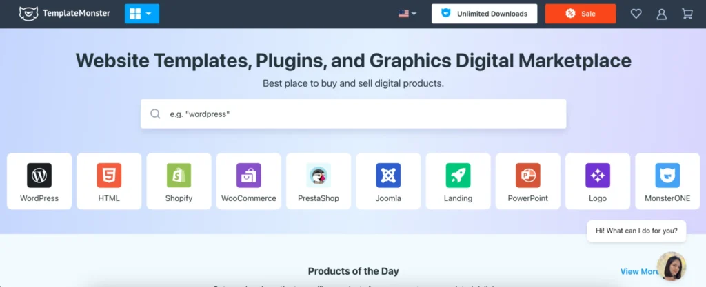
TemplateMonster is a website template, plugins and graphics marketplace.
Have a Shopify website and you’re looking for a good theme? Got to TemplateMonster.
Need something similar for WordPress? Check out TemplateMonster.
Need a really good powerpoint presentation template to wow your boss at work? Seriously, TemplateMonster’s got you.
TemplateMonster has over 120,000+ digital products that you can use to create your own website. It’s a marketplace designed to connect over 2,000+ independent developers with you, so that you can make your website look great, make it mobile-friendly and more.
If you have no idea how to install templates or properly set them up on your site, TemplateMonster will be able to help you do that as well. Oh, and if you’re looking for free WordPress templates; there are plenty of those over there too.
Personally, I prefer paying for WordPress templates because they give me full ownership and customization options for my site, but if you’re a new blogger and just want to get started; a free WordPress template will be fine for the first six-ish months.
How to Look for a Mobile-Friendly WordPress Template on TemplateMonster
This one’s for my super, super newbie bloggers or anyone who hasn’t used TemplateMonster before. To make sure that you’ve found a mobile-optimised template, follow these steps:
From the search results, once you have found a template you like, choose “Live Demo.”
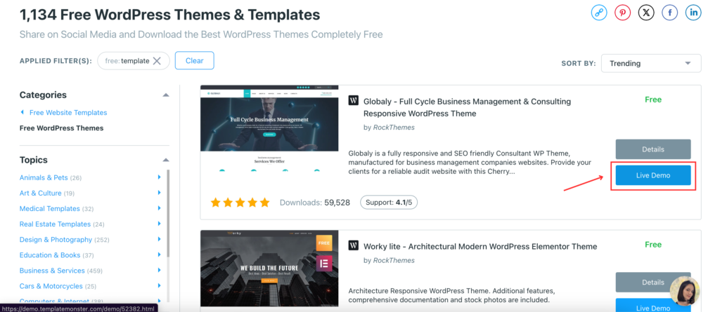
If you clicked on “Details” to learn more about the theme, you don’t need to go back or anything, the “Live Demo” option is there too:

You’ll arrive at a demo site of sorts. You’ll be able to see all the different pages, post types and all the other features available. And this is really good for understanding how far you can go with the template you’ve selected.
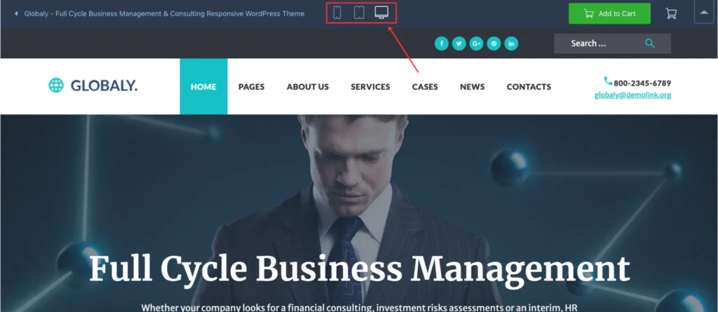
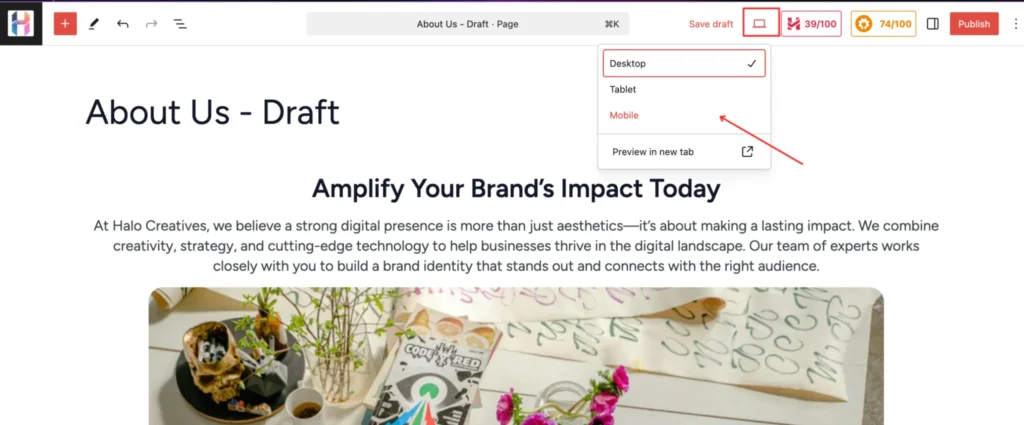
At the very top of the page, you’ll see these three icons for desktop, tablets and mobile. By clicking on them, you will be able to see how the template will look across all of these different devices.
Generally, I’ve found that for website templates, especially premium ones, developers do a great job at making sure everything’s optimised from a design perspective. So, if you’re looking for a quick fix, this is the route you should take.
As I’ve mentioned before, TemplateMonster also provides a service to install the template for you, and that’s great for anyone who’s not tech savvy. I spent waay too much time on installing my site’s template.
This is a great option; I would recommend it.
2. Use WordPress Plugins
Let’s say that for whatever reason you don’t have the option to install a custom template. Maybe your WordPress subscription doesn’t support that, and you just want your blog up, and you don’t want to spend any money.
I completely get that; subscriptions are expensive. And that’s fine. In this particular case, yes, your options will be limited, but you can still make your site mobile-friendly.
I. Do A Site Audit
Not an SEO site audit, though I would recommend reading that blog. Just a quick audit of your site to make sure what works and what doesn’t work. Take your phone, and look at your website. Go through all the landing pages; make a note of the different designs and templates used there; and boom, you’re done!
Well, not really. I would suggest that you create a spreadsheet or something and make a note of which page looks good on mobile. Here are questions you need to ask:
- Does it look bad?
- Are images too big?
- Are there too many H1 and H2 titles showing up?
- Is it easy to go through this page?
- Is anything cutting off?
- Do you have to scroll horizontally (left to right or vice versa, depending on your site’s language)
For the first question, I would suggest having another set of eyes look at the page. But generally, if five out of these seven questions is a yes, you need to optimise that page.
Once you’re done, now you’ll have a list of pages that you need to optimise for mobile.
Start with those pages.
II. Download Elementor
On your WordPress dashboard, go to Plugins on the sidebar and select Add New Plugin. This should open the Add Plugins page where you will type Elementor in the search bar.
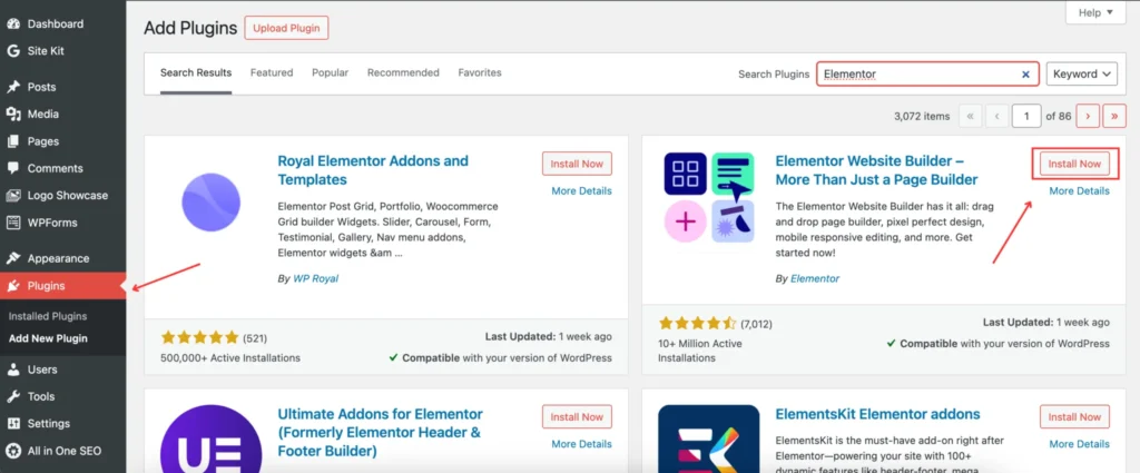
Install Elementor and activate it. For what we’re doing, you don’t need to get the paid version. This is fine.
III. Turn on Mobile View
Once you’ve installed Elementor correctly, go to Pages and click “Edit” on the page you want to optimise. Open it on a new tab.
You’re probably familiar with how the WordPress page editor looks like; once you’re in there, switch views from desktop to mobile (or even tablet; but we’ll get to that later).
This page will be your reference. Now go back to Pages.
IV: Edit with Elementor
Click on Add New Page. This opens the new page template.
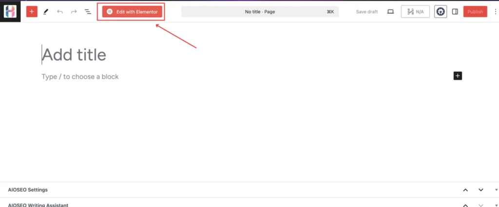
Now, since you’ve installed Elementor, you’ll see the option to Edit with Elementor. Click on that.
V. Switch to Mobile View
Once the Elementor environment loads, make sure that you’ve switched to the mobile view.
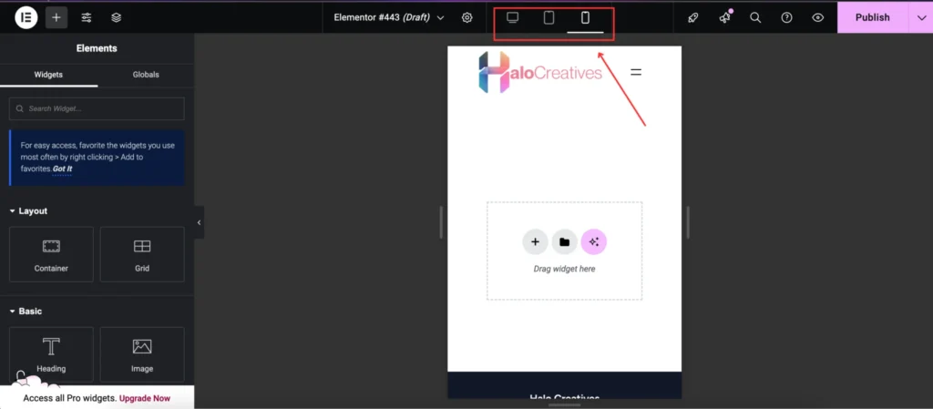
Now you can start editing. Using the mobile version of your chosen page as a reference, start adding widgets. Start off with the heading, text; add an image; make it look nice.
The options are limited; but there’s a lot you can do here. Elementor is quite intuitive, making it awesome for new bloggers.
Pro tip: Alternate between all three views to see how your website looks on desktop, tablet and mobile.
It doesn’t have to be fancy; it just needs to be clear for users.
And that’s it!
Use WP Rocket to Enhance Your Site’s Performance
Now, you’re 100% going to need something to add to make sure your website’s speed and performance are up to industry standards. There’s no point in having a fully mobile-optimised website if your audience doesn’t get past loading.
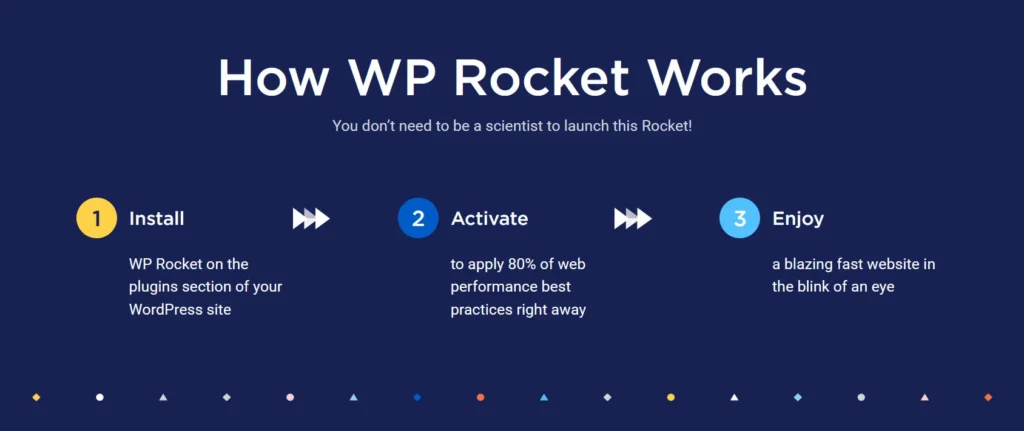
So, if you’re looking for a quick way to boost your website’s speed, WP Rocket is your best friend. With just one click, WP Rocket enables caching, significantly reducing load times. It also features automatic cache preloading, so any changes you make are instantly reflected without extra effort. Browser caching ensures that essential resources like images, JavaScript, and CSS files are stored locally on users’ devices, speeding up return visits.
Beyond caching, WP Rocket enhances performance with GZIP compression, reducing file sizes for faster delivery. For eCommerce sites, it smartly excludes checkout pages from caching, ensuring a smooth transaction process.
Plus, its compatibility with most WordPress themes and plugins makes integration hassle-free. Get WP Rocket today by signing up here.
- If you’re curious about how to install WP Rocket, check out my blog: How to Improve Your Website Speed and Performance with WP Rocket.


You May Also Like

How to Create Content in Our Brave New AI-Powered World

On Writing Introverts: How to Write an Introverted Character Who’ll Steal the Scene